Factory
Design-system kit 1.1.0: a new look, released once, pinned twice
· Toolkit · 2 min read
The design-system kit 1.0 kept the look our products already had: Arial, square corners, 2 px borders on buttons and inputs, uppercase labels on tags and KPI tiles, a dark footer. We wanted them to look like current SaaS products. In two copies of the design system that would have been the same restyle twice; since the shared kit of 13 October, it is one release.
A new surface on the same components
On 14 October 2026 we released design-system kit 1.1.0. Inter replaces Arial and ships inside the package, never from a font CDN. Corners get small radii: 3 px for chips, 4 for controls, 6 for cards. Borders on buttons and inputs drop to 1 px, cards get a soft shadow, and the footer is a light panel.
Markup and page structure stay as they were, and no component prop was removed or renamed. The look is core: a product still sets only its twelve colour roles, because roles for type, radius or depth would let the products drift apart again. The kit's guarantees did not change: the focus ring, 44 px touch targets, contrast, tones marked by shape as well as colour.
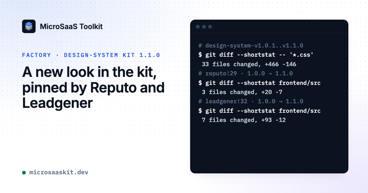
Between 1.0.1 and 1.1.0 the kit's stylesheets changed in 33 files, 466 lines added and 146 removed, and every one of its 384 baseline captures changed.
What the products changed
Reputo and Leadgener each pin the kit in one line of their frontend's package.json; the frontend also builds their login pages. Reputo moved that pin from 1.0.0 to 1.1.0 an hour after the kit's merge request merged, so it took the 1.0.1 patch as well. In its app code, the frontend's src, three files changed: its check, incident and DNS-record cards now read the kit's new card radius and elevation tokens, 20 lines added and 7 removed.
Leadgener pinned 1.1.0 two hours later. In its app code, its own stylesheets now read the kit's font-weight tokens instead of a literal 700. One screen needed a code change: its opportunities table has nine columns, so it takes the new stackBelow="wide" option: below 1160 px of its own width, it shows each row as a list of labelled fields, with the date and the time as separate parts.
On the toolkit, a new look is a minor version: you pin it, run the checks its changelog lists for the release, and re-check your screens; a table too wide for its box takes one prop.